

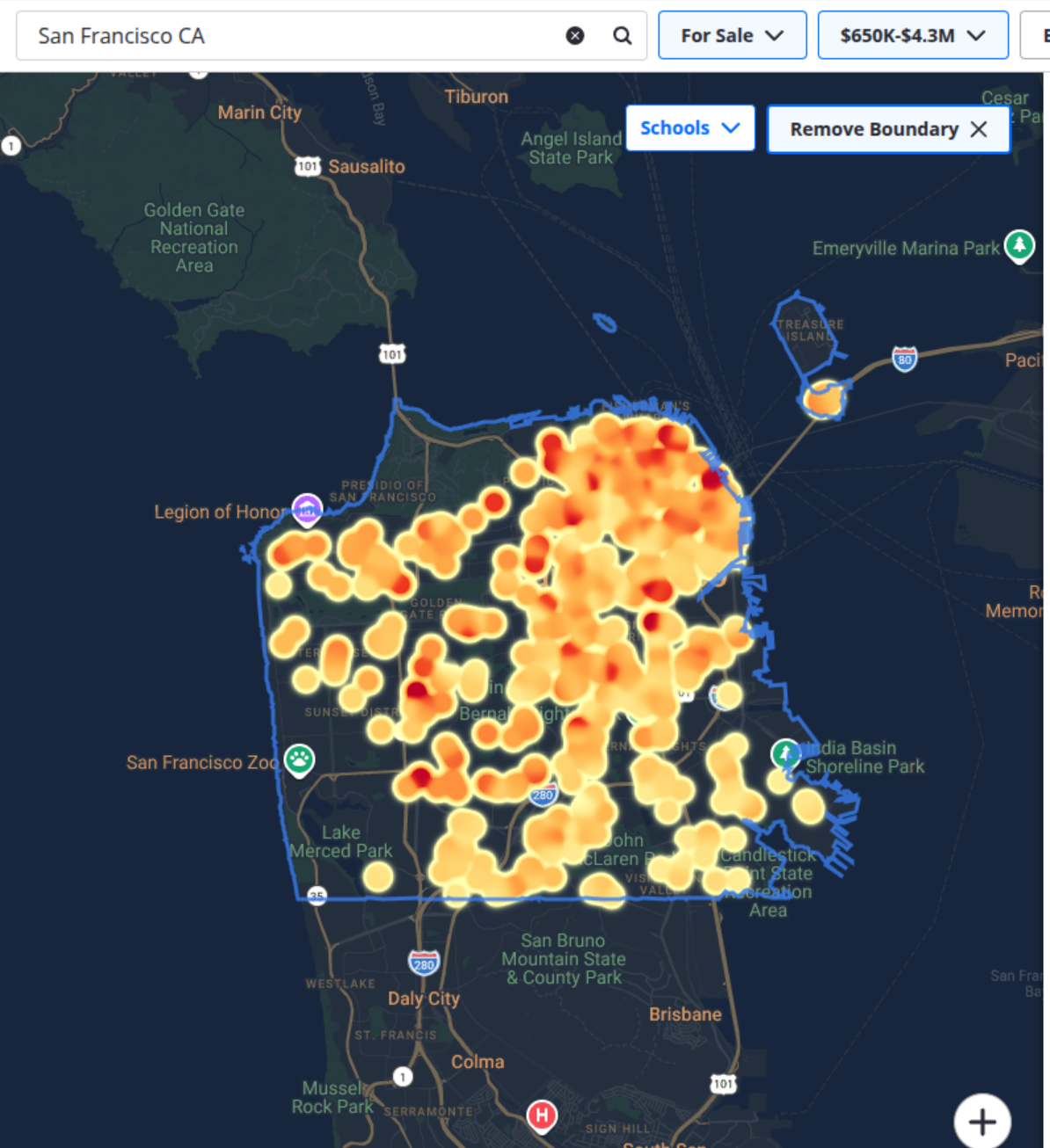
While downloading the full set of available listings from Zillow is useful, raw data alone doesn’t tell much of a story. To make the insights more tangible, I built a visual layer on top of it—specifically, a pricing heatmap. The result instantly reveals how home prices spread across San Francisco. Here’s an example focused on listings between $600K and $1M.
Here’s another example of the pricing heatmap in SF with the range from 1 million to 8 million.
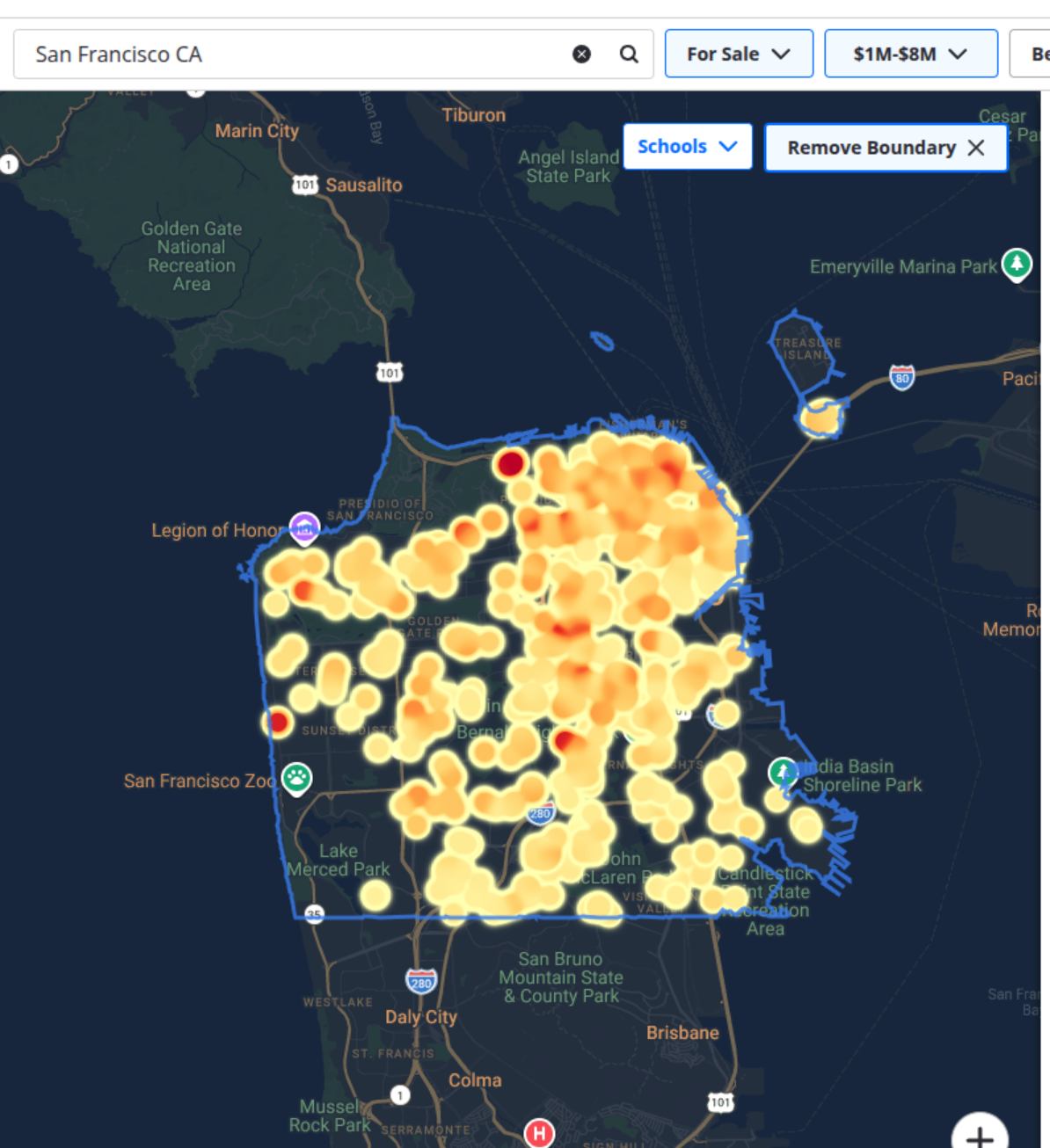
Heatmaps spotlight what matters—revealing outliers and helping you zero in on the neighborhoods or properties worth a closer look.